A concurrent usability test ran during A/B test T379 to assess conversion impact of:
1-column vs 2-column cart/checkout
Step sequence changes
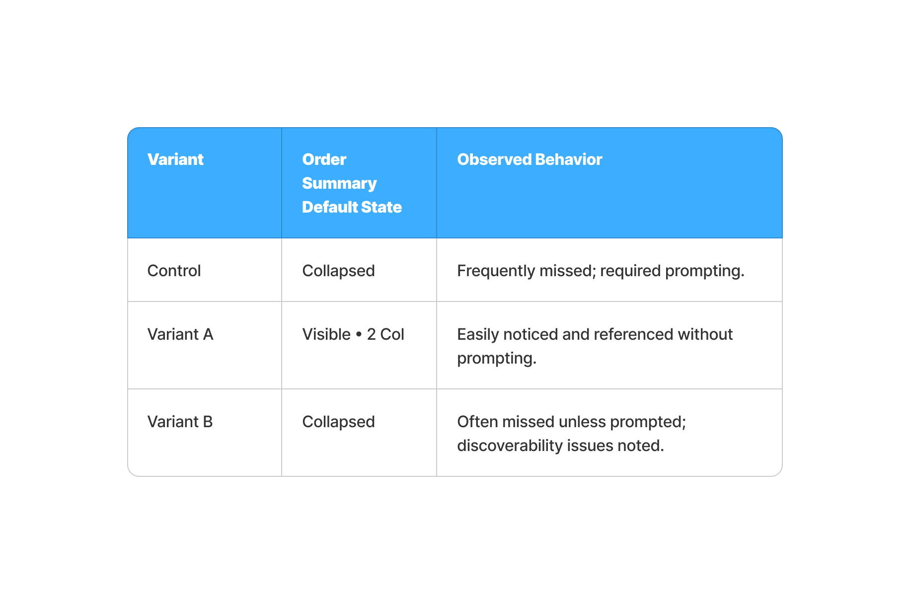
Persistent vs collapsed order summary
Parallel Moderated usability study
default vs single col vs 2-col
desktop
High-store states only
$200/participant
10 participants
Total: $2000
Participants to Recruit
MUST-HAVE CRITERIA
Criteria to include or exclude to find the required participants.
NUMBER OF PARTICIPANTS NEEDED
8 total
5 enthusiast
3 circumstance
Worked alongside another UX researcher and cross-functional teams in product, design, and digital marketing
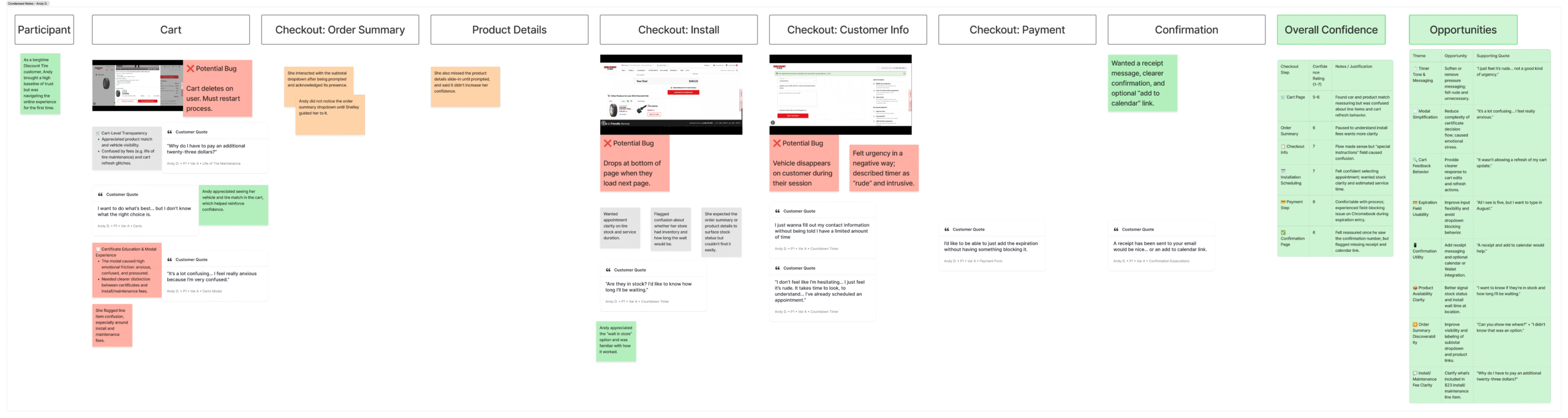
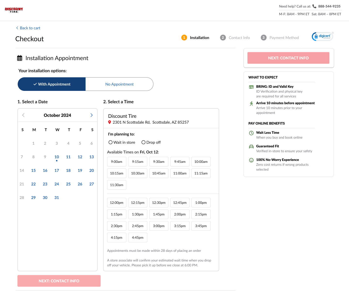
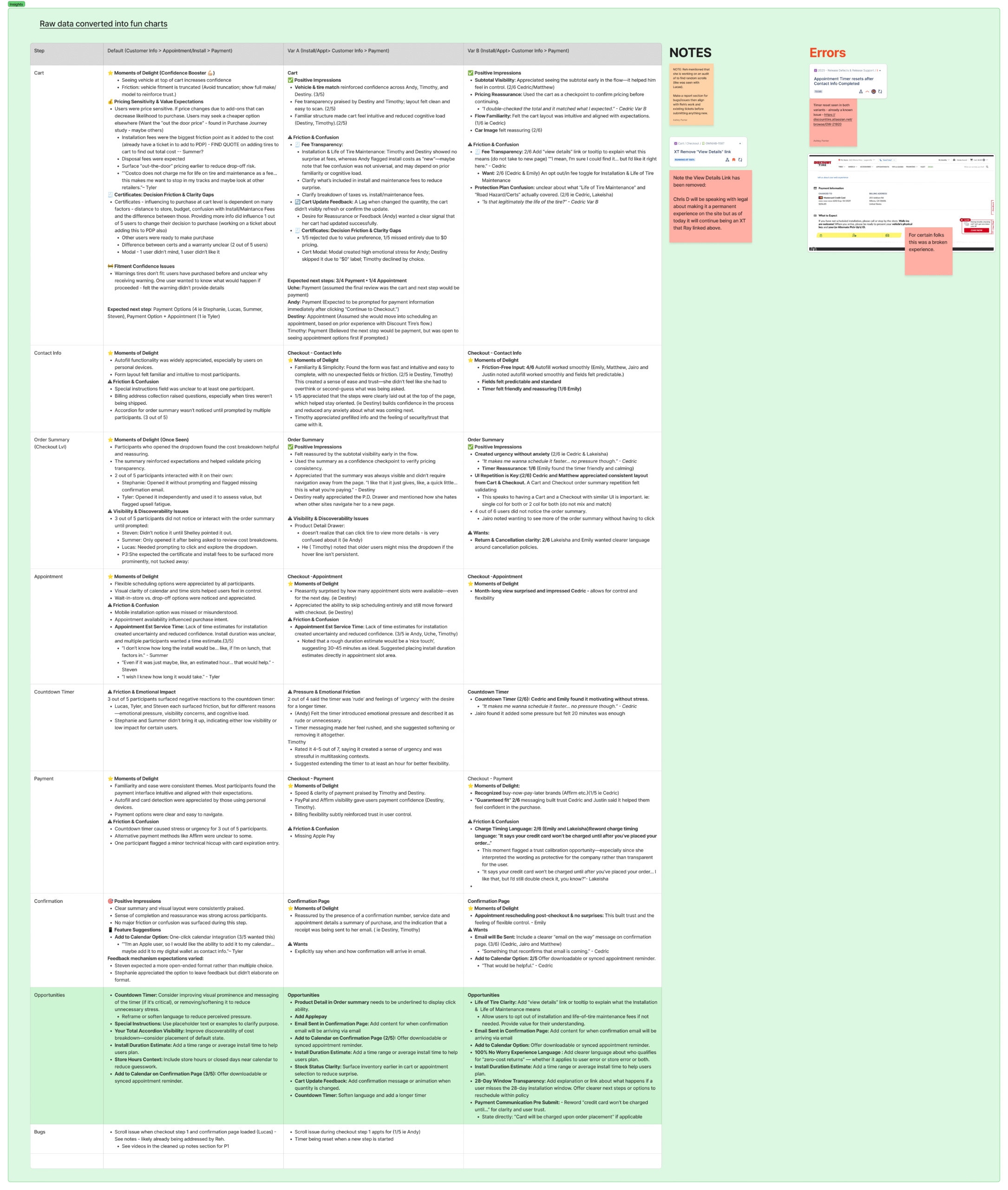
This study evaluated three cart and checkout experiences—Control, Variant A (Two-Column with Step Reorder), and Variant B (One-Column New Design with Step Reorder)—to determine which layout best supports ease of use, purchase intent, and transaction success.
Key focus areas included:
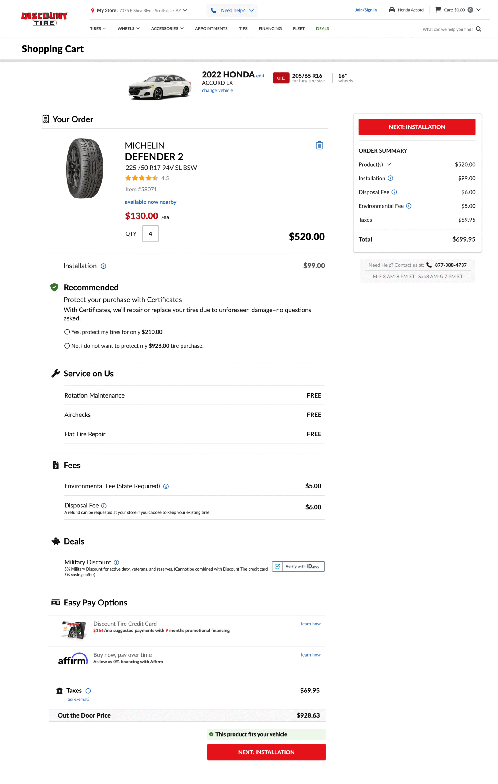
Order Summary Clarity: Measured user understanding, confidence, and perceived completeness with a simplified, collapsed summary.
Product Detail Accessibility: Assessed whether clickable product names (opening a detail drawer) improved confidence and reduced checkout exits.
Friction & Drop-off Analysis: Identified layout complexity, visibility issues, and trust signal gaps contributing to hesitation or abandonment.
Comparative User Reactions: Analyzed behavior and feedback across variants to determine which design most effectively supports a distraction-free, trustworthy checkout experience.
2-Col Cart & Checkout
Single-Col Cart & Checkout
A campaign that delivered
Advance with Variant A’s flow and layout. Avoid selective hiding — consistency matters.
Shelley Hall • UXR
The visibility and usability of the Order Summary (“Your Total”) varied significantly across variants, directly impacting user confidence and flow clarity.
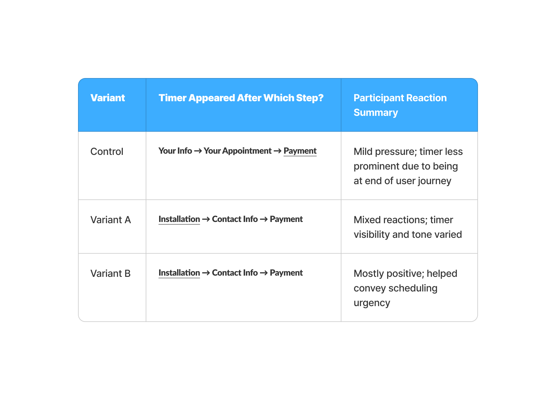
Reordering the checkout steps (Appointment → Customer Info → Payment) in Variant A and B broke conventional flow expectations. While recoverable, the shift caused initial disorientation for most users who expected payment immediately after Cart.
The countdown timer introduced urgency at the Appointment step, but participant reactions were mixed. While some found it helpful and motivating, others described it as emotionally pressuring or unclear — especially regarding what would happen when the timer expired.
Primary button should explain next step “Let’s schedule your appointment first” to reinforce the flow logic.
Add step indicators or progress bar early in the flow to reduce uncertainty.
Consider combining Payment and Customer Info into one step to reduce cognitive load for our customers and better match their expectations for Checkout.